Feedback Example
Art Brief
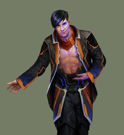
Armand “Geist” Walker
Artist: Matt Zeilinger
“Armand “Poltergeist” Walker is one of the leaders of the criminal gang Los Muertos. He is called the Poltergeist because he has no regard for physical or digital property, smashing through cyber defenses, even destroying his own rig in what looks like random violence, but it is all in the process to get to the prize and walk away with the score.
Los Muertos gang members are mostly-Latino (but ethnically diverse) criminals, a major organized crime power within the SanSan megapolis.
They wear “stealth” tattoos, luminescent tattoos that can be visible and glow with a spooky blue-white light or invisible depending on a subdermal electric charge. Some of them “pass as normal” during the day and toggle on the tattoos for meetings or clubbing or illicit activities. The tattoos are visually inspired by the Mexican Day of the Dead, and that’s where the gang gets its name.”
After working with me for years, this artist and I have a visual shorthand and usually know exactly what to expect from each other.
This is a rare occasion where we weren’t quite on the same page.
1.
1. The first sketch hid much of the design and told the viewer nothing of the character’s personality.
This indicated to me that the artist might not have a good understanding of the narrative we needed the character to project.
At this point the artist and I took some time to discuss character motivations and background to help inject some additional storytelling and depth.
Exploring some new options, the artist went back to the beginning and submitted pose thumbnails.
2.
2. Because this was a mature product line with 20+ previous character ID images, it was important to pick a pose and silhouette that would be distinctive at both printed size and viewer-to-table distance.
“A” is nicely recognizable, and nothing similar had been used in previous IDs.
3.
3. The first sketch didn’t really incorporate the pose dynamically.
4.
4. To show explicitly what I was looking for, I coached a coworker into the pose and general attitude that I had in mind.
5.
5. When the revised sketch had the same problem, I realized that the artist was downplaying the horizontal space because he was worried about the image not fitting within layout constraints.
I did a quick sample layout of the reference image to demonstrate that he had plenty of room to make the gesture a bit more flamboyant .
6.
7.
6/7. The most notable IP detail of the design is his bioluminescent tattoos.
To have the artist focus on them as a design unto itself, and to make sure the character didn’t get lost in the tattoos, we decided to keep the tattoos on a separate layer over the illustration.
I frequently use this approach so that we can edit small things internally without having to complicate workflow by bringing the artist back in for minutiae when they’ve already moved on to their next project.


